
Syd Barrett, the main songwriter of Pink Floyd at the time, is credited with coming up with the name, he had spray painted the word “hipgnosis” on his door. This the story of Aubrey “Po” Powell and Storm Thorgerson. Together, they created the most influential graphic arts business that created artwork for record albums and record marketing.

Storm and Po did not create the concept of album covers as artwork, but they certainly pushed graphic design to be recognized art. For them, it began when Pink Floyd asked them to design an album cover. space rock, so it needed a swirling montage of images. The record company was unhappy that the cover only contained a very small picture of band; one you have to look carefully or you’ll miss it. That was a bit of a concession to the company bankrolling the record and artwork.

After designing the cover of A Saucerful Of Secrets, Pink Floyd asked Storm and Po to design for posters for Pink Floyd shows. It was then that Storm and Po decided to start a business since more work started to come in after the Pink Floyd jobs.
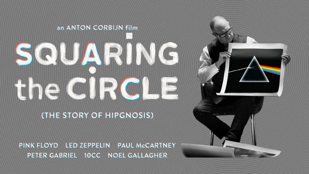
Squaring the Circle: The Story of Hipgnosis (2022) traces the rise and fall of this incredible creative partnership. Directed by Anton Corbijn, who has made several feature films (The American, Control, A Most Wanted Man), but has focused mainly on directing music videos. Obviously a talented man behind the camera, thankfully, he focused on the story, rather than impressive visual effects. The story should be the focus and the viewer is rewarded with a very compelling trip through the 1970s, when Hipgnosis was in business.
The 1970s represented a time of rock excess, along with big recording budgets, a lot of drugs, and an appreciation for artistic expression. Hipgnosis was a lens for the excess of the period. Pink Floyd, Led Zeppelin, Bad Company, Alan Parsons Project, Genesis, 10cc, Renaissance, Black Sabbath, Emerson, Lake & Palmer, Paul McCartney, Yes and Wishbone Ash are some of Hipgnosis’ clients. An impressive list.

The story is mostly told through the memories of Po and interviews with Jimmy Page, Robert Plant, Paul McCartney, Roger Waters, David Gilmour, Peter Gabriel, Nick Mason and others. Friends and former photographers and designers also help to tell the stories.

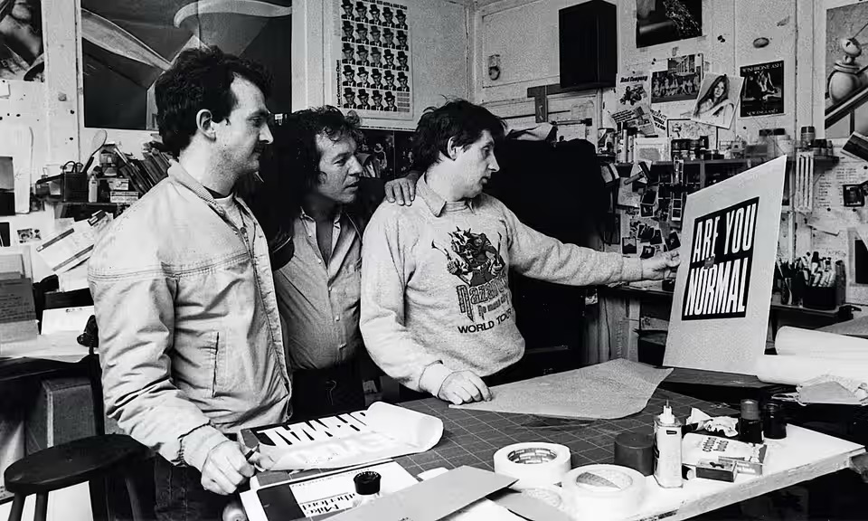
In the beginning, it was just Storm and Po. Their first office was an old dance studio with a piano. They sold the piano, and with the proceeds bought their first cameras, design and lighting equipment. Later, they would add staff and take on Peter Christopherson as a partner.
The stories of the photo shoots are fascinating. Some of the stories are about designing and shooting the artwork for Led Zeppelin’s Houses of the Holy, Paul McCartney’s Band on the Run, and Pink Floyd’s Wish You Were Here, Animals and of course, Dark Side of the Moon.
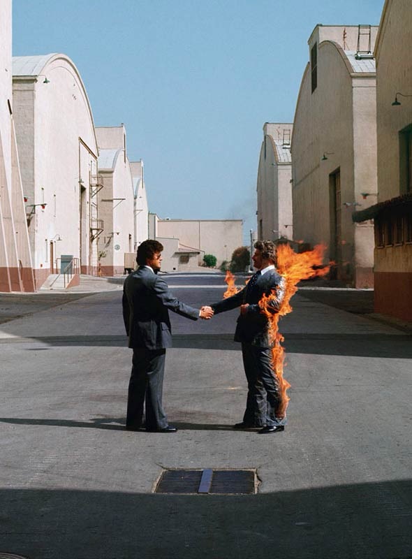
For Wish You Were Here, it was decided to use a man on fire for the cover, as it exemplified the theme of being used up by big companies, specifically the recording industry. A stuntman agreed to be set afire (multiple times according to Po). The album was then shipped with a black wrapper over the cover.
Led Zeppelin’s Houses of the Holy involved using two painted children shown climbing a hillside of circular rocks. This was before computer generated imagery, so what you see was photographed and supplemented by additional rocks.
In the film, Po says that getting a call from an ex-Beatle was like receiving a call from God. Paul McCartney & Wings’ Band on the Run featured a cover with a group of escaped criminals in a spotlight. McCartney wanted the group to include people well-known by the public. See cover story

For his album, Venus and Mars, McCartney has a graphic design in mind. He had Storm and Po fly to Los Angeles for England to discuss the project. McCartney explained his concept and was surprised when Storm said no. He had other ideas for the design, but McCartney wanted his idea. Storm turned and went home to England, leaving Po to create McCartney’s design. McCartney among others called Storm the rudest person, who was fixated on his own design ideas and could be quite cruel in rejecting the ideas of others.

Later, McCartney turned to them again when he wanted a particular design for his 1970s greatest hits collection. It involved an art statue, Semiramis, Queen of Babylon, that McCartney wanted photographed on Mt. Everest. That was a bit impractical, so it was photographed in the Swiss Alps instead.

Animals by Pink Floyd, proved to be a different kind of challenge. Fly an inflatable pig over Battersea Power Station for the album cover. It floated between the smoke stacks. The pig broke away. The police marksman scheduled to be there, was not there. Air traffic was halted at Heathrow Airport and RAF fighters were in the air, but no pig. It turned up in a farmer’s field.
Sometimes the cover design had little or nothing to do with the album. Pink Floyd’s 1970 album, Atom Heart Mother, had nothing to do with cows or farms. That didn’t stop Storm and Po to photograph a milk cow for the album cover. The album would not have the band’s name or photo on the cover, not even the album’s name. Naturally, the record company went nuts. This just wasn’t done.

Presence by Led Zeppelin featured a black statuette on the cover and interior photos. The idea for the black statuette supposedly came from 2001: A Space Odyssey. Interesting story. Hipgnosis also did Led Zeppelin’s last album of new material, In Through the Out Door. An elaborate and detailed barroom set was built and photographed with six patrons. The idea was than there would be six different album covers, each from the perspective of a character. The album would be sold in a plain brown wrapper so the consumer wouldn’t know which cover they were buying.

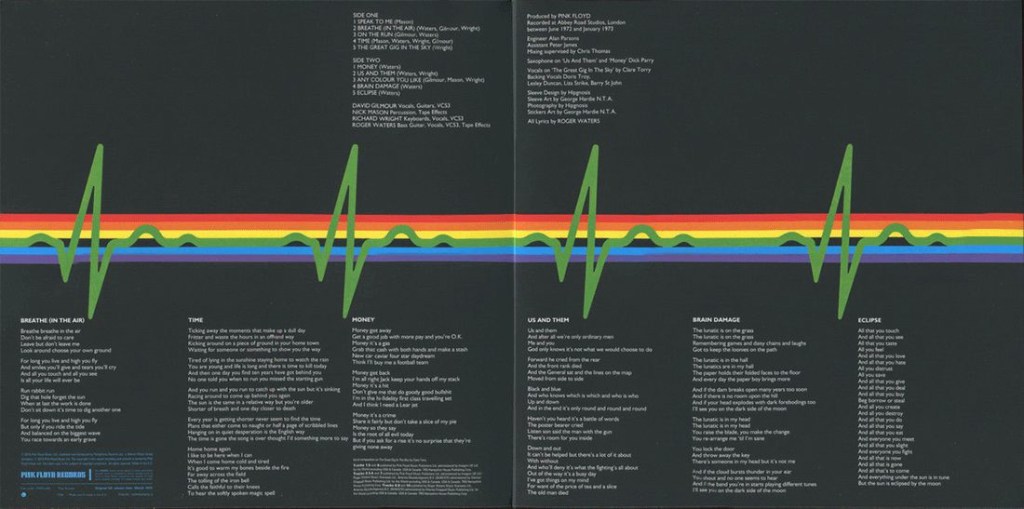
Dark Side of the Moon, by Pink Floyd, was arguably the most important design Hipgnosis created. From a physics magazine, the idea of the prism emerged, which the band immediately approved. It was Roger Waters that suggested turning the light wave into a heartbeat.

The success of Dark Side of the Moon changed things for Hipgnosis, Po reflects, and he felt is also changed for Pink Floyd. “Success drove a wedge between band members, and it did for us too,” Po said in the film.
Noel Gallagher (Oasis, High Flying Birds) was one of the interviewees, not a contemporary of Pink Floyd, but around since the 1990s and told how he just stared at the artwork of albums he owned. As a bandleader, he could relate to the importance of an album’s artwork, and invested in album art that mirrored the effort that went into creating the music inside. When album art mattered. “It was as an extension of the art on the inside,” Gallagher said in the film. “Now it doesn’t matter. No one cares.”
—
The mid-70s was the heyday of album art. It mattered to the musical artists, and money was flowing by the record companies. You could do anything that musicians and call it art. Land art became album art, and no idea seemed too crazy to consider. The drugs didn’t hurt.
It’s wild to hear 80 year olds talking about their LSD experiences. “We could easily move away from the norm, to think out of the box, and drugs certainly enhanced that ability,” Po said. Syd Barrett’s experience was a different matter, he was a casualty of LSD. In the film, Po relates a story of Barrett showing up at the Hipgnosis office, unrecognizable after a few years in the LSD wilderness.
At the end of the decade, the story changed. It all ended. The partnership broke up and they didn’t speak for 12 years. Storm died in 2013.
I loved this film. There are many more stories than what I have related here. To hear those stories described by the people who were there, is outstanding. Most of those people are old geezers now. The 1970s was a special time, certainly if you were a rock music fan.
5/5


Leave a comment